Saturday 29 May 2010

Elmore Leonard, The Big Bounce.

The requirements for the Elmore Leonard breif, was to read a book written by the writer Elmore Leonard and interperate the meanings so that a graphic could be made for the book cover.


I read 'The Big Bounce', which had themes of gun crime, baseball, money and death throughout the book. This is what graphics I focused on for the creation of the book.


Swiss Type Project

The Swiss Type project enabled me to look at type and layout in great detail. A requirement for the project was to find a peice of packaging that could be used for the project.


I chose to redesign a Heinz Chicken Noodle Cup Soup. Meaning I had to record all of the dimensions of the box and also every peice of type.
I had to replace the type on the package that I created within Illustrator. I look at different fonts, point sizes and weights in great detail.


De La Salle

De La Salle is a high school, located in the North West of England.

Two local film students were creating a video in which to advertise the school. The DVD's purpose was to show new pupils an insight into the school. I collaberated with the two film students and also another graphic designer to create a motion graphic which could be placed at the beginning or end of the DVD.


E4 Esting.

I also entered the E4 Esting competition, which allowed me to design a short advertisement for the channel 'E4'.

I used a comical angle for the design of the sting, which showed a duck swimming and being circled by a purple shark fin, only to find out that the purple fin is actually the E4 logo.

Other stings I created for the project, also went along with a comedy film, here are a few more that I created.

Solo Project.

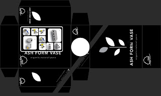
'Solo', is a company which sells vases made from natural materials. Each vase is created by hand to give a different and unique feel to every vase they produce.

We were given the breif to produce packaging that could be used to hold the vase. We also had to produce the Information Graphics, showing how the vase is created. Meaning that a simple set of vector imagery had to be created to show the process, that the consumer could easily understand and follow.


Berlin: Flip Book.

From the trip to Berlin, Germany a breif was made to create a graphic which would explain your time there.

I decided to create a flipbook based on dance and movement, which is something what happened every night that we stayed in Berlin.

Here is the final version of the flip book that I filmed to show the animation.

Feel Good Juice Drinks.

"Feel Good", was a project to create a short advertisement sting for a beverage company called 'Feel Good'. Feel Good produce smoothies and juice drinks.

I decided to focus on the theme of making your own juice drinks. This can be very time consuming and frustrating, when all you need to do is pop down to the shop, and pick up an already made juice drink that will taste more refreshing.

Thursday 27 May 2010

Client Breif: Clink Clink.

'Clink Clink' was the first project and compeition of the Client Breif, which I won.

Clink Clink was a film produced by local film director Pamela Taylor, who wanted a design which could be used with the DVD packaging. Clink Clink focused on a theme of the awareness of drink driving.

The way in which the front cover was manipulated was to deliberately look blury. This was done by overlaying the same image three times and placing them slightly in different positions. The image was also purposely manipulated to appear darker to show the sinister side of the DVD.

The image reinforces your vision once you have had a drink. Also the fact that the image focuses on a car handle, links well with the drink driving theme of the film.

Business Practice.

For my Business Practice project, I decided to create a branding for a business which could be used for a real company.

I created the business 'Reflex' which means to bend, be thrown back or reflected. Other definitions suggest involuntary action or response, automatic response or reaction.

'Reflex' is a motion graphic sting company, which offers stings for advertisements in web and television medias.
I helped to create a brand for 'Reflex', by means of Logo, Business Card, Letterhead, Compliments Slip and Envelope, which could be used within the company.

The logo was purposely manipulated to be on a slight angle, this was to reinforce the idea of movement, which helps to link in with the motion graphics that the company offers.
The use of the colour green throughout my work helps to suggest freshness to the actual company and also work it may produce.


Wednesday 26 May 2010

Client Breif: Penguin Design Competition 2010.

Here are the book covers that I created for the Penguin Design Competition.

The two designs focus on Lewis Carroll's 'Alice in Wonderland' and Patrick Süskind's 'perfume'.

The imagery behind the cover for 'Alice in Wonderland' is linked to the Mad Hatters tea
party, a tea party was a big part of the Victorian lifestyle. Subtle imagery and drawings
were placed into the design, hiding in tea cups, plates and dishes. The imagery appeared
in color and also black and white, this gave a feeling of a dream or someone’s
imagination.

Whilst the cover for 'perfume' uses a rose which was used to symbolize a number of things. The first thing the rose symbolized was the theme of death which runs throughout the book. The rose could also represent an ingredient which could be used to create the perfume. A splatter of blood also appears on the cover of the book, this again could link in with the theme of death.
The way in which the blood hasn’t congealed into the paper could again link well with
the theme of perfume, as this could represent a spice or ingredient. The imagery was
purposely edited to be quite dark to set the darkness of the books themes.


Final End of Year Show Work

This is the work that I will be showcasing for the End of Year show.

I have decided to showcase my Swiss Type project, which was based upon a Heinz chicken noodle package. The other focuses on my honours project, which was to brand a local musician by means of a sting, album cover, vinyl and CD graphics.


Honours Project

My Honours Project focused a local musician.

I decided to brand him with the use of photography and motion graphics. I was able to produce a CD/ Vinyl sleeve, record label, logo and motion sting to advertise the artist as a musician.

The motion sting was heavily inspired by an early form of entertainment and motion, known as the 'Zoetrope'.

A zoetrope was a drum which revolved, inside the drum was a series of photographs which had slight movement in each. The viewer looked through a viewfinder on the outside of the drum, which allowed them to see inside. As the light passes through each view finder rapidly, it fools the eye in to believeing their is movement within the Zoetrope.