Wednesday, 2 March 2011

Work Experience

RadioPS logo and banner.

The logo design was for a specific gaming community website. The competition was posted on the internet and out of the various contestants my design was chosen.


Here is the final logo banner used on the website. A little more editing to the website will be needed to ensure continuity to the over all flow of the design.


The people who held the competition were that happy with the final design that they wanted the logo to be printed on to a Tshrit to be sold on their website.


Youtube background layout for a group of gamers:


Forum Signatures:


The final overall signature:

(Composition, layout, vector imagery and text created by me. A total of 60 will be created.)


Website Banner/Logo for a community game.


GT Law Solicitors:


David Bibby Design Logo Animation:


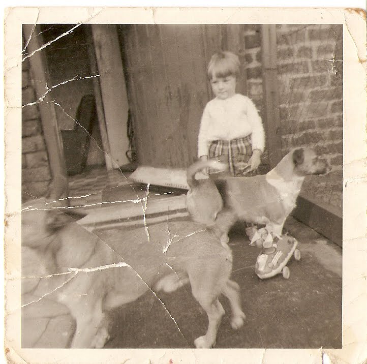
Picture Restoration:


Extend Your Reach:


Band Video:


Saturday, 29 May 2010

Elmore Leonard, The Big Bounce.

The requirements for the Elmore Leonard breif, was to read a book written by the writer Elmore Leonard and interperate the meanings so that a graphic could be made for the book cover.


I read 'The Big Bounce', which had themes of gun crime, baseball, money and death throughout the book. This is what graphics I focused on for the creation of the book.


Swiss Type Project

The Swiss Type project enabled me to look at type and layout in great detail. A requirement for the project was to find a peice of packaging that could be used for the project.


I chose to redesign a Heinz Chicken Noodle Cup Soup. Meaning I had to record all of the dimensions of the box and also every peice of type.
I had to replace the type on the package that I created within Illustrator. I look at different fonts, point sizes and weights in great detail.


De La Salle

De La Salle is a high school, located in the North West of England.

Two local film students were creating a video in which to advertise the school. The DVD's purpose was to show new pupils an insight into the school. I collaberated with the two film students and also another graphic designer to create a motion graphic which could be placed at the beginning or end of the DVD.


E4 Esting.

I also entered the E4 Esting competition, which allowed me to design a short advertisement for the channel 'E4'.

I used a comical angle for the design of the sting, which showed a duck swimming and being circled by a purple shark fin, only to find out that the purple fin is actually the E4 logo.

Other stings I created for the project, also went along with a comedy film, here are a few more that I created.

Solo Project.

'Solo', is a company which sells vases made from natural materials. Each vase is created by hand to give a different and unique feel to every vase they produce.

We were given the breif to produce packaging that could be used to hold the vase. We also had to produce the Information Graphics, showing how the vase is created. Meaning that a simple set of vector imagery had to be created to show the process, that the consumer could easily understand and follow.


Berlin: Flip Book.

From the trip to Berlin, Germany a breif was made to create a graphic which would explain your time there.

I decided to create a flipbook based on dance and movement, which is something what happened every night that we stayed in Berlin.

Here is the final version of the flip book that I filmed to show the animation.